Mobile Device usage is on the rise, how will your website respond?

Over the last few years Australia has witnessed a boom when it comes to mobile technology and its use. The 8th annual Australian Mobile Phone Lifestyle Index recently uncovered some amazing statistics:
- The number of Australians who own a smartphone rose from 63% in 2011 to 74% in 2012
- The number of Australians who own a Tablet rose from 16% in 2011 to a huge 40% in 2012
- 87% of Aussies are expected to own a smartphone or tablet (or both!) by mid 2013
- 77% of mobile users access websites from their mobile device
- 86% of users like to use a combination of websites and mobile applications
That equals almost 17 million Australians who will use their mobile devices to access websites in 2013, making the 17 million dollar question… How will your website look to these users?
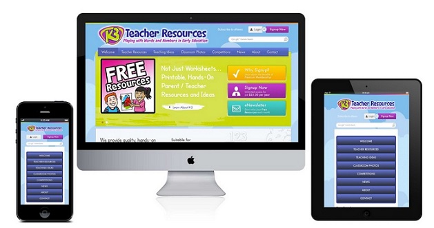
 A great example of effective responsive web design - K-3teacherresources.com website across iPhone, desktop and iPad.
As companies like Apple, Samsung, Microsoft and more continue to release new mobile devices, screen sizes are continually changing and evolving. A customer using an Apple iPad, for example, might see your website very differently to another customer using a Samsung Galaxy, and vice versa.
The key to ensuring that your website looks the way you want it to look to ALL users is a responsive website design.
So what is responsive website design (or RWD)? RWD is essentially an approach to website design that provides the best possible viewing experience for the customer. That means minimal zooming, panning and scrolling, resulting in a website that is visually appealing and – most importantly – functional across any size screen.
The key strength of a responsive website design is it’s functionality. A great responsive design is able to adapt to whatever size screen it is displayed on. It will look like a modern, mobile website from your smartphone or tablet, and will look like an amazing full scale website on your desktop computer as well.
Implementing a responsive design for your website can be done in a number of ways. You can create a new website that utilises responsive technology for a new look and feel as well as increased usability over mobile devices. Alternatively, you could integrate responsive design into your existing website to make it more user-friendly, without a huge change in the overall look and feel.
So, is a responsive website design the right thing for your business? If you are looking for increased functionality, better audience engagement and improved conversion rates then the answer is going to be a resounding YES!
To find out how NBM can help your business to implement a responsive web design for your new or existing website contact us today.
Tags: Mobile Usage, Responsive Design, Mobile Site


